GRAPHIC DESIGN
SIGNAGE
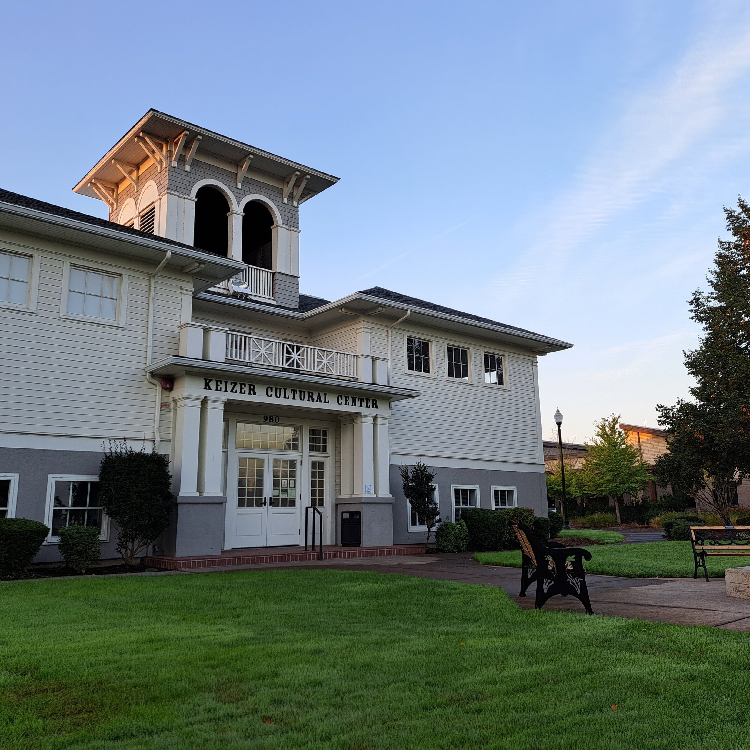
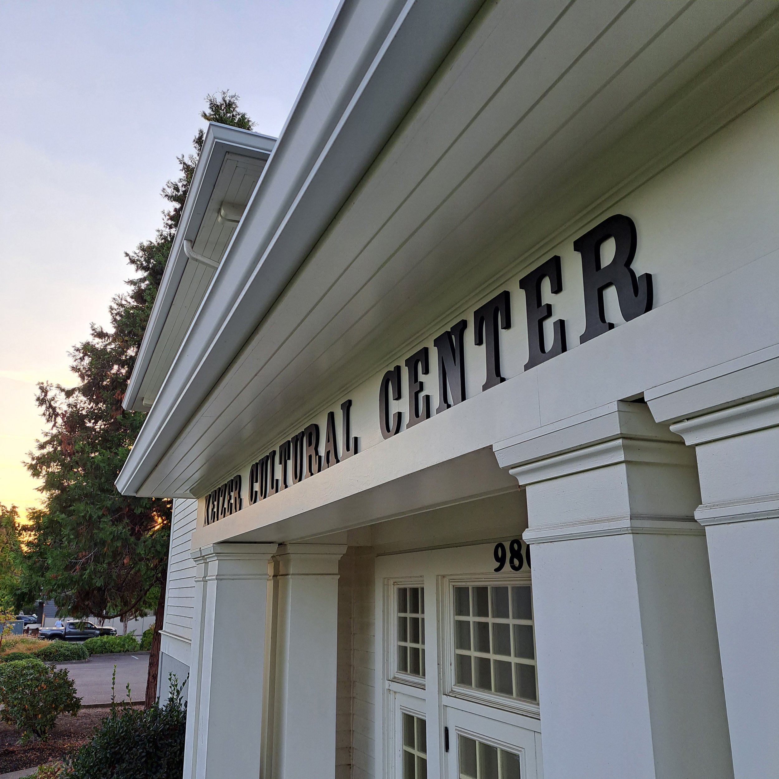
Keizer Cultural Center
&PROBLEM
In their recent days spent at the state fair and even at their KeizerFEST booth, the volunteers of the Keizer Cultural Center found that an overwhelming majority of the people they spoke with had no clue where the center was — or what was housed there. While there is a monument sign near the sidewalk, it has far too much text to be effective, and there were no identifying marks on the actual building itself. Also part of the challenge was factoring in the age of the building and to design something that complimented that time period.
&SOLUTION
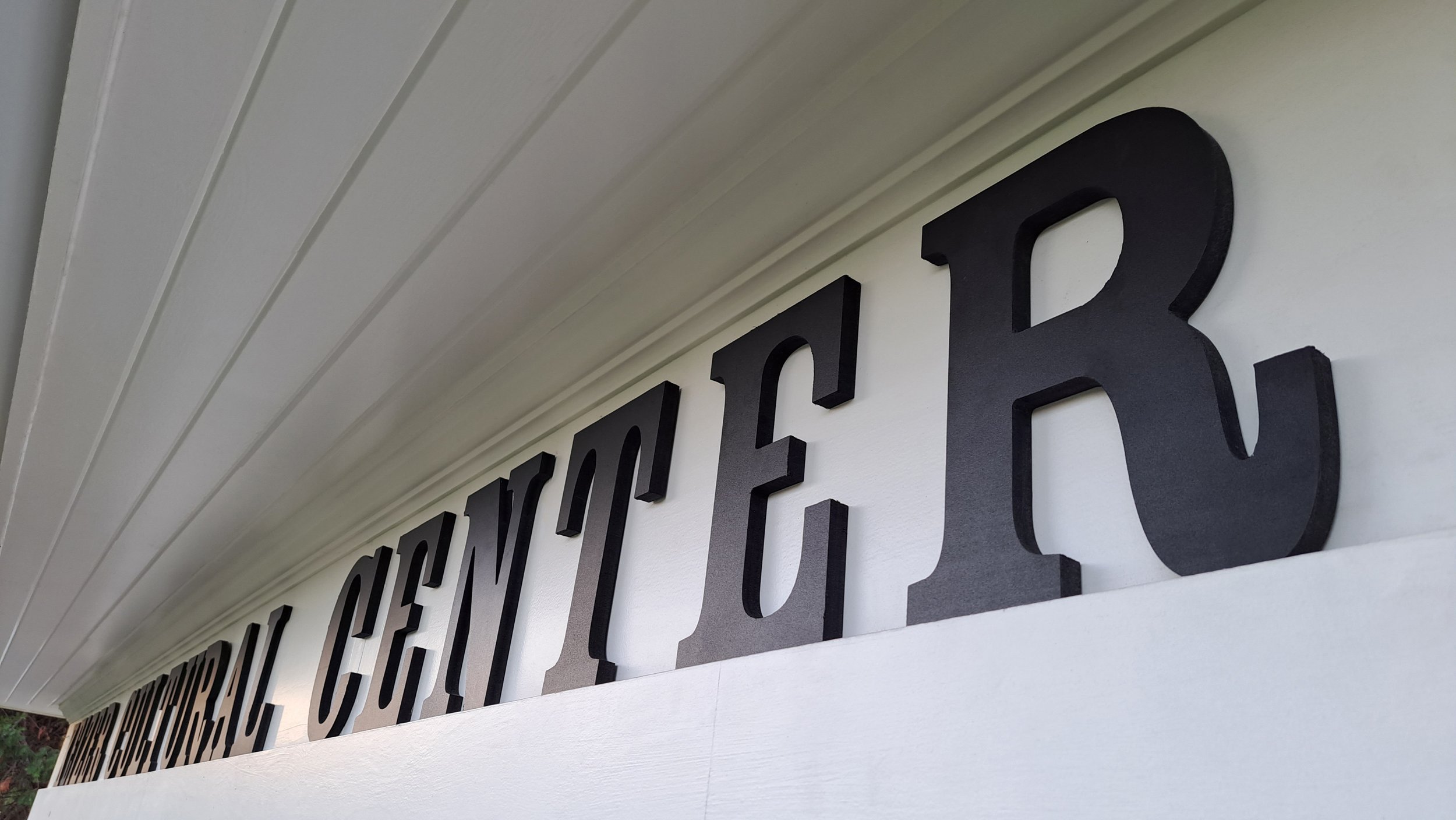
First, we needed to identify where (and in what manner) they could add signage onto the building. We surveyed the site, conducted drive-by evaluations of the property, took measurements, and provided them with 3 options: a hanging sign, this solution, and a more ambitious yet still subdued option with lettering on each of the three facades on the front of the building. This final solution utilizes three dimensional black lettering, a slab-serif typeface with roots in the early 20th century, and enough letter-spacing to be seen easily from a distance and from passing traffic. Stay tuned for the second part of the solution,